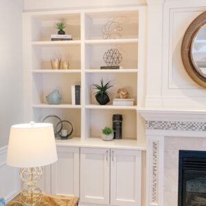
 One of the questions we are often asked is “how do I style a bookcase, so it looks like the ones in magazines?”
Often bookcases and built ins become the dumping ground for all sorts of Knick knacks, magazines, books etc. resulting in bookcases that look cluttered and disorganized.
Here are our suggestions on how to create a beautiful looking bookcase, that looks like a professional styled It and is magazine worthy!
- Start by removing everything and choose visually interesting items to start to layer back in
- Don’t overcrowd each shelf
- Use items that are meaningful and sentimental
- Use different styles of décor pieces – metal/wood/ceramic/books
- When using books try to stick to hardcover books and remove the sleeves if possible
- Layer items together and ensure they are of different heights
- Add some greenery
- Rotate some of the books – have some vertical and some horizontal
- Balance the colour palette on the shelves – i.e. don’t just use black on one shelf, pepper the colour over several shelves from top to bottom
- Put a décor object on top of a stack of books for visual interest
Ultimately, “less is more” when it comes to styling your bookshelf and creating that “Designer” look.

